Michael C. Gross was an Associate Producer on Ghostbusters and Executive Producer on The Real Ghostbusters and Ghostbusters II. The art direction and final design of the no-ghost sign was done by Michael Gross with help from Brent Boates.[1][2][3][4] He was a well known artist. He is not to be confused with the actor from "Family Ties."
Ghostbusters Related[]
- Ghostbusters - Associate Producer
- - Designer of the No-Ghost Sign
- The Real Ghostbusters - Executive Producer to all 140 episodes
- - Commentator on The Real Ghostbusters Dvd Box Set
- Slimer! - Executive Producer to all 33 episodes
- - Writer to episode Monkey See, Monkey Don't
- Ghostbusters II - Executive Producer
Other work[]
- Heavy Metal - Associate Producer (1981)
- Legal Eagles - Executive Producer (1986)
- Kindergarten Cop - Executive Producer (1990)
- Beethoven - Producer (1992)
- Beethoven's 2nd - Producer (1993)
Trivia[]
- Michael Gross appears on Time magazine's corner flap during the first montage in Ghostbusters. [5]
- Joe Medjuck and Michael Gross were very involved in The Real Ghostbusters and took the show quite seriously. They read every script and tried to make sure that nothing was going to embarrass anyone. They were so involved that they almost got the show canceled because they wouldn't do certain things that ABC wanted done. It drove the other producers crazy because Medjuck and Gross wanted some stuff on the air that they didn't want unless they liked it. [6]
- Michael Gross's son Dylan Gross worked as a camera loader on Ghostbusters II.[7] It was one of his first gigs and he currently works on movies and television as an aerial director of photography.
- Tim Lawrence was inspired by the Blues Brothers and designed the Scoleri Brothers based on them. Visual Development Artist Henry Mayo helped refine the designs with extensive input from Michael Gross.[8]
- Ivan Reitman became concerned the designs might have been over the top but Gross believed it would lighten the moment.[9][10]
- On page 15 of Ghostbusters Volume 2 Issue #13, Oscar's principal is listed as Mr. Gross, a possible nod to Michael Gross
- On page 20 of Ghostbusters International #1, in panel 2, framed on the wall is the "We'll Kill This Dog" cover of National Lampoon's January 1973 issue, designed by Gross.
- In Ghostbusters International #2, on page 1, in panel 2 and 3, once again framed on the wall is the "We'll Kill This Dog" cover of National Lampoon's January 1973 issue, designed by the late Michael Gross.
References[]
- ↑ Michael C. Gross (2009). Ghostbusters- Slimer Mode (2009) (Blu-Ray ts. 01:20:54-01:21:04). Columbia TriStar Home Video. Michael Gross says: "The no-ghost logo was in Danny Aykroyd's original script. I take credit as having art directed and designed the original logo but I did not conceive it."
- ↑ Joe Medjuck (1999). Ghostbusters- Commentary (1999) (DVD ts. 37:59-38:04). Columbia TriStar Home Video. Joe Medjuck says: "And then, I think, Mike Gross redesigned a little bit of shape of the ghost. But the basic idea was always--"
- ↑ Michael Gross (2019). Cleanin' Up The Town: Remembering Ghostbusters (2019) (Blu-Ray ts. 32:28-32:29). Bueno Productions. Michael Gross says: "I went to the one I knew the best."
- ↑ Richard Edlund (2019). Cleanin' Up The Town: Remembering Ghostbusters (2019) (Blu-Ray ts. 32:30-32:32). Bueno Productions. Richard Edlund says: "Brent Boates designed the logo."
- ↑ Shay, Don (November 1985). Making Ghostbusters, p. 92. New York Zoetrope, New York NY USA, ISBN 0918432685. Paragraph reads: "Time's characteristic corner flap bears the image of associate producer Michael Gross, while U.S.A. Today's golf victor is Michael McWillie -- a designer hired to produce the bogus covers (Time title and format by permission of the publisher, Time, Inc.)."
- ↑ Beyond the Marquee Joe Medjuck Interview 9/15/14
- ↑ Ghostbusters HQ "CLASSIC GBHQ: Interview with Dylan Gross" 3/12/2015 (originally posted in 2000) Dylan Gross says: "At the time, my job was pretty lowly. A couple of factors were there - first, there was quite a bit of responsibility in even the lowest camera department job, typically loading and unloading the film into the camera magazines. On any movie, the handling of the film takes a special importance - rightfully so - all of the days work is trusted at one moment to the person handling it. Second, the guys in the camera department wanted to send a message that I was very lucky to have gotten into the camera department so easily. Most, if not all of them, paid many more dues before they were allowed membership. So, for the first week, I wasn't even allowed on the set. They kept me on the camera truck, where all of the equipment was, building wooden shelves for the camera cases. I was finally allowed to hook up the video monitors that show what the film cameras were shooting (video assist). On today's sets, that is a separate job from the camera department, but being relatively new, the monitors and equipment were left for the camera crew to deal with. Most of my days were spent wiping Ghostbusters Slime off of piles of tangled fifty foot video cables."
- ↑ Eisenberg, Adam (November 1989). Ghostbusters Revisited, Cinefex magazine #40, page 14. Cinefex, USA. Tim Lawrence says: "Knowing that Dan Aykroyd had written this bit, one of the first images that came to me was the Blues Brothers--and it was this idea of a tall thin guy and a short fat guy that colored my thinking as I developed the characters. I began by generating some rough drawings in my very cartoony style, and then I involved a longtime friend and collaborator, Henry Mayo, to help me firm the concepts into something that was more realistic, yet still broad in intent. It seemed to me that the original draft of the script was 'monster shy' and the ghostly apparitions that did appear were very much of the see-through person variety. There was no marshmallow man, no terror dogs--just a variety of vaporous people.. I could not imagine a Ghostbusters movie without any creature-type ghosts, so I very consciously began pushing the concepts for the Scoleris into a broad caricature direction. I took my cues from the script and extrapolated my own interpretation along lines that I felt would represent the brothers' internal evilness rather than merely suggest what they looked like in life--hence the very exaggerated ghosts that appear in the movie. Both Ivan and Michael were enthusiastic about this approach, and so I hoped to generate further characters of this type of work progressed."
- ↑ Eisenberg, Adam (November 1989). Ghostbusters Revisited, Cinefex magazine #40, page 13. Cinefex, USA. Line reads: "To bring the Scoleris to life, Reitman and Gross turned to storyboard artist Thom Enriquez--another Ghostbusters veteran--to first lay out the basic action in the scene."
- ↑ Eisenberg, Adam (November 1989). Ghostbusters Revisited, Cinefex magazine #40, page 11 and 13. Cinefex, USA. Michael Gross says: "The Scoleri brothers we deliberately made slightly cartoonish in their design and actions. At one point Ivan got a little worried about this and asked me, 'Do you think we've gone over the top!' I said: 'We need it in the picture at this point. Given how scary some of the other sequences are, it would be good to go over the top with these characters.' I thought it would lighten the moment. It was the first time we saw full-scale ghosts in the film, and I thought we really needed them to be as wild as they were."
External Links[]
Gallery[]
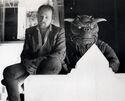
Michael Gross sitting by Zuul puppet (Credit: Michael Gross)
Michael Gross sitting by Zuul puppet (Credit: Michael Gross)
Michael Gross and Don Shay at Temple of Gozer set (Credit: Michael Gross)
Michael Gross talks to Bill Murray and Harold Ramis while Dan Aykroyd sleeps (Credit: Michael Gross)
Michael Gross between takes in the Biltmore banquet room (Credit: Michael Gross)
Photo from Making Ghostbusters p.11
Autographed Photo (formerly owned by Paul Rudoff)
Michael Gross and friend Louisa Grassi Kaestle behind the scenes of Ghostbusters II on the Upper East Side (Credit: Michael Gross)
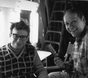
Michael Gross after he "combed" Rick Moranis' hair behind the scenes of Ghostbusters II (Credit: Michael Gross)
Michael Gross poses with Vigo (Credit: Michael Gross)


